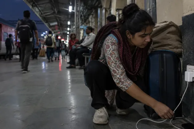
Say you are on a crowded railway platform a few minutes before departure. Your phone is face-down on your suitcase because the charging cable barely reaches the wall socket. Its rear panel wakes up, but you still cannot tell whether the interruption needs an answer or can wait until you board.
That is the uncomfortable truth behind a second screen: repeating an alert is decoration unless the small panel removes the next step. The decision is simple. Judge the Lava Virat Curve's rear display by the jobs it can finish without making you turn over, unlock and navigate the main phone.
The current feature list is only a starting line
GSMArena reported that the Virat Curve's Mini Display can surface notifications, battery status and custom messages, while also offering music controls and emojis. Those functions are not useless. A quick battery check while the phone is charging face-down saves a movement, and pausing a song without lifting the device can be convenient.
But a list of things a panel can show is not the same as a list of tasks it can complete. A notification that names the app but hides the sender still demands the main screen. A music widget that can pause but cannot move past an unwanted track is a remote with half its buttons missing. An emoji is personalisation, not utility.
The test should therefore be harsher than “does it light up?” Ask whether the rear panel ends an interaction. If it merely tells you to begin the same interaction somewhere else, it has moved friction rather than removed it.
This distinction matters before purchase because novelty is easiest to judge in a demo and hardest to value after a month. A colourful animation can win the first minute at a shop counter. A reliable control earns the hundredth use at home. Buyers should therefore ignore how busy the panel looks and count how often it prevents the unlock-and-search routine they already know.
First, it should let you dismiss the unimportant
The most useful notification feature would not be a brighter preview. It would be triage. The panel should show enough context to identify the sender and category, then offer a small set of deliberate actions: dismiss, mute for now, mark as read, or answer an incoming call. That is enough to deal with a delivery update, an office group or a family call while the phone stays where it is.
This needs restraint. Putting a miniature notification shade on the back would recreate the distraction that the smaller screen is supposed to avoid. No scrolling feed, no tempting badges, no cramped keyboard. The panel should help you say “not now” and return to the platform, meeting or dinner table.
Privacy matters here too. A rear screen is visible to everyone across a desk or train berth. Message text should remain hidden until you deliberately reveal it, with separate controls for sensitive apps such as banking, UPI and authentication tools. Convenience that broadcasts a one-time password is the sort of cleverness nobody asked for.
A sensible setup would begin private and become more revealing only when you choose. Calls could show a contact name; banking alerts could show only the app; personal messages could expose nothing until the phone recognises an intentional touch. The exact controls matter less than giving you control per app. One blanket setting will either reveal too much or make the panel too vague to help.
Then it should turn the main camera into the selfie camera
A rear display sits beside the cameras, so framing is its natural second job. It should provide a live preview, a shutter control and a clear countdown. The point is not to squeeze the whole camera app onto a small rectangle. The point is to let you frame a group, place the phone down and capture the shot with the better-positioned cameras.
There is useful precedent inside Lava's own range. Digit found the rear panel on the Lava Agni 3 especially handy as a viewfinder for selfies. That is the kind of job a second screen can finish: you compose, trigger and confirm the capture without walking around to the front display.
The Virat Curve should go one step further by making the hand-off boring. After a shot, the rear panel should briefly confirm that a face was not cut off and offer retake or keep. When you later open the main camera, it should resume at the same photo rather than dump you at the home screen. Good continuity is invisible; broken continuity makes the extra panel feel like a separate gadget glued to the phone.
Camera controls also need predictable limits. Keep zoom, portrait effects and detailed settings on the large display, where they can be understood. Put framing, timer, shutter and retake on the rear, where they solve a physical problem. Dividing the work this way makes the small panel useful without pretending it can replace the full camera interface.
Its controls should work while the phone stays put
Music controls make sense only when they cover the actions people repeatedly need: play, pause, next, previous and volume. The same principle applies to timers, voice recording and calls. Each tool needs a complete short loop, not a launcher that pushes you to the front screen after the first tap.
This is also where haptics and error prevention matter. A tiny target can turn a casual swipe into the wrong command, especially on a moving train or with damp fingers during monsoon weather. Large controls, a firm vibration and an undo moment would do more for daily usefulness than another animated face.
The panel should also respect posture. When the phone is face-up, the rear display can sleep. When it is face-down on a stable surface, glanceable controls can appear. In a pocket, both displays should stay quiet. Those rules reduce accidental taps and make the feature feel intentional instead of permanently needy.
More rear-screen apps would make the idea worse
The obvious response is to keep adding widgets until the second display looks powerful. That is the trap. Digit's review of the older Agni 3 said the transition between its rear and main screens did not continue smoothly, and it judged the smaller panel's practical value limited. A longer menu cannot repair a broken hand-off.
Every extra app creates another miniature interface to learn, another privacy setting to check and another place where the front and back can disagree. Weather, steps and decorative messages may look impressive during a shop demo, but they do not justify another layer of software if the basic call, camera and notification flows remain unfinished.
The counter-intuitive answer is fewer jobs with deeper control. A good rear screen should behave like a small set of physical buttons that happen to change shape. It should be predictable enough that you stop thinking about which screen is active. If Lava cannot deliver that consistency, the better option is to keep the panel quiet and spend less attention managing it.
What to actually do
Back on the railway platform, the useful version of that glowing panel tells you the alert can wait, lets you dismiss it, and leaves the phone charging on the suitcase. If the shipping software cannot complete that small loop, treat the second screen as decoration when deciding whether the phone suits you.
- Check whether notifications show enough context and offer actions, not just icons.
- Try the rear-camera preview and confirm that capture, review and retake all work from the back.
- Test the switch from rear controls to the main screen before you buy.
- Hide message content for banking, UPI and authentication apps.
- Wait for independent reviewers to test the final software, not just the feature list.